Client
Think City
Industry
Consulting
Year
2022
Role
Art Direction
Branding
Publication
Design
Kai Fam
Wailun Lee
Typeface
Min Sans
Neue Haas Grotesk
Description
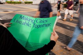
In 2022, Menn Studio had the privilege of collaborating with Think City, a trailblazing city-making agency on a mission to transform urban spaces into inclusive, liveable environments. As Think City evolved in expertise and scope, it was time for a brand identity that reflected their growth and new ambitions. The aim was to retain Think City’s existing logo and signature blue-and-green palette while reimagining the brand to resonate with a wider audience and align with their evolved mission.
We refined the logotype, achieving a balance between the lowercase “think” and small caps “CITY” to reflect Think City’s dual identity: approachable yet authoritative. The iconic blue and green palette was revitalised with brighter, more vibrant tones, appealing to younger audiences, while maintaining recognisability.
Typography was at the heart of the redesign, blending modernity with accessibility. We chose Min Sans, a sharp, contemporary sans serif with a subtle calligraphy-inspired aesthetic that suggests the art and cultural context embedded in Think City’s work. It exudes creativity, innovation, and a thoughtful connection to urban culture. Paired with Neue Haas Grotesk, a warm and rounded typeface that enhances readability and conveys professionalism, inclusivity, and approachability, these typefaces struck the perfect balance between creative expression and formal communication, making the brand versatile and engaging for Think City’s diverse audiences.
This reimagined identity amplifies Think City’s mission of inclusivity and liveability, positioning them as leaders in urban transformation. It empowers them to connect meaningfully with communities, governments, and corporations alike, strengthening their role as catalysts for change in creating better cities.